beastie pretending to be a leaf
I spotted this little green beastie pretending to be a leaf in the garden at the weekend.
Rick Hurst Web Developer in Bristol, UK
MenuI spotted this little green beastie pretending to be a leaf in the garden at the weekend.
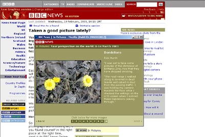
I am really chuffed to see that one of my photographs made it onto the BBC news site on the talking point | have your say | taken a good picture lately section.
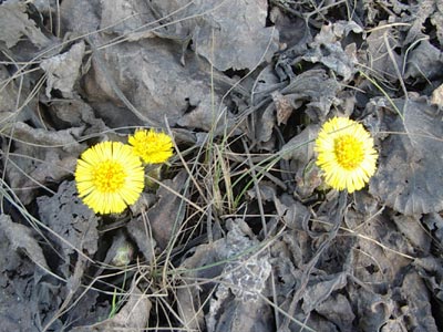
My “dandelions” picture is number 10 in the “Your perspective on the world: 8-14 March 2003” gallery.
This makes up for all those years of failing to get one of my paintings on Tony Harts gallery as a kid!
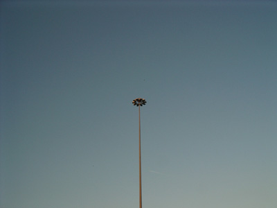
imagine just for a second that you have been sat in front of a couple of flickering monitors for eight hours drinking coffee, then you wander outside and are as alarmed as I was to see this huge mushroom out of the corner of your eye, protruding from a roundabout.
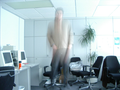
I’ve always shyed away from putting pictures of myself on my site, but this one had to go up – me floating around…
on IE on a mac, the grey vertical subheading bar was expanding to fill the whole screen and clicking onto the lab menu item is causing safari to freeze..
fixed the IE problem – specified 12px widths to the grey box and the dynamically created boxes holding each letter.
looking into the safari problem…. CPU goes to 100% when you try to load anything within “the lab” section.
fixed! thanks to tim at twisty.com – he pinpointed it to a problem with the text-transform:uppercase property used on the heading selectors – safari didn’t seem to like applying it when some of the content inside was wrapped in divs and some not – if you remove the spaces, the problem was solved. I wanted to keep the spaces and so I moved that property to the individual divs surrounding each letter.
the same problem presumably doesn’t happen on the vertical submenu because I had already replaced all the spaces with “ ” because without doing that they weren’t creating any vertical space.
something i’ve always said* – from an interview with Andrew Beach:-
Q. Tell us what the future (net) looks like?
A. It will be more useful and less visible. It has to finally break free of the desktop and laptop to hit its next evolution.
* no proof
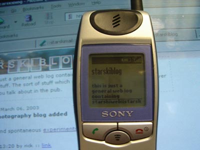
Because all the formatting and styling for this site is done with CSS, this site should degrade to work on any device which supports HTML.
Below, starskiweb is being displayed on MS mobile explorer on a Sony j5e phone.
On the styled version (i.e. when displayed in a web browser which supports CSS), the site menu, login form and logos are displayed in a column at the right hand side. Without the styling these appear at the bottom of the text. I chose to do it this way because some mobile devices are very slow and as the menu grows, if it appeared at the top for vanilla content it would be a pain to scroll through it to get to the first blog post.
At some point I will create a seperate unstyled menu page which can be bookmarked for mobile devices and used tomove between the blogs.
Are you sure you haven’t just got the caps lock key on? I mean of course i’d never make a stupid mistake like that, but….
The road verge on this industrial estate where I work is covered in rotting leaves and caked in mud from passing traffic. I was holding the camera down pointed at the floor to check the settings on the LCD screen when I noticed these dandelions poking through.
like where you want to create a repeated pattern like a background image in a web page:-
In Photoshop marque the section you want to make a pattern from, goto Edit, and then define pattern. Then select the entire page and go to Edit, Fill.., select Use Pattern and select your pattern from the custom pattern drop down.